Design postmortem
This is inspired by a macOS app that I use frequently. That app, called DateDiff (or Date Difference Calculator), was the product of some old Apple sample code from ~2012. More info in this Twitter thread.
UX Design
It was fun iterating on the screen layout for this.
- I started with the calendar layout (first programming problems were figuring out which day of the week a date falls on and also showing the edges of the adjacent months)
- Initially the “other” months were non-bold but I changed them to faded, a lovely touch that Neven Mrgan had suggested to me for my forthcoming game Ball und Panzer Golf
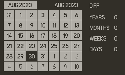
- Next I needed a way to show the two dates, I chose to use “tabs”
- Eventually I went from showing just the month and year to showing the full date on the tab
- Then I added the “TO” word between them and made the deselected tab a darker colour
- System menu provided just enough options to hide/show years/months/weeks
- Displaying currently selected date (square) and current date (underline) also took a little back and forth
- I defined the size of the grid cells as variables so I could adjust the calendar layout easily
Screen layouts
- Compared to the earlier image, you can see in the final design:
- goes to the screen edges
- cells are slightly bigger and wider
- full dates are on each tab
- underline current day
- better text layout
- monospaced numbers
Early
Final

Buttons
Fitting all my functions into the app was also great fun. The system menu can hold three items which was just enough for me to put toggles for years/months/days. The d-pad can control the cursor by day and month. I decided to use the A button to toggle between the to/from dates. And then left the B button as a “shift” or modifier button, allowing the d-pad to change by week and year. The exact arrangement of this took a little experimentation and usage to pick what felt right.
Conclusion
Creating a “simple” screen like this is a great excercise in user interface design. If you think it looks obvious and simple that means I’ve done a good job. But rest assured that it took a good number of iterations over a few days to get there. I encourage you to pick a suitably simple screen or scenario and dive into making it as good as you can, you’ll learn a lot along the way about details and use of screen space.